When I first did the literature research on dealing with audio in iphone development, it had several choices to go but I chose AVFoundation Framework which is one of several frameworks that we can use to play and create time-based audiovisual media. It provides an Objective –C interface we use to work on a detailed level with time-based audiovisual data. For an example, we can use it to examine, create and edit media files. We can also get input streams from devices and manipulate video during real-time capture and playback.
Available Screens and how they connect
Basically, this application has improved accessibility for blind or visually impaired users to listen to music/ audio books with guidance of voice prompts. The voice prompt feature has been developed by using the flite-1.4-iphone library.
 According to what you see in the above screens, each and every tap on any screen helps the user with proper guidance to handle every feature of this application. for an instance, when the user navigates to the music playlist screen and taps (selects) a song, it want play at once since we don't know whether he/ she tapped it purposefully to play that song or tapped on it by mistakenly mainly because they cannot see what they currently select. What EyeMusix player does is, once the user tapps on a song in the list, it reads the song title to the user aloud and if he/she wants to listen to it, the same tap should be done once again. then, the screen navigates to player screen and plays the song.
Like the same, the concept that I've used through out the app is "hear before you confirm"
Now, i'll explain the features implemented in the individual screens
EyeMusic welcome Screen
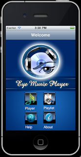 This is the very first screen that appears when you select the EyeMusix icon in the menu of the simulator. It says "welcome to eyeMusix player" to let the user know that they are in the welcome screen now. It basically contains four buttons each does a simple navigation task. But keep in mind that before going to another screen, it always reads aloud what button was clicked and if the user taps the same button for the second time only the navigation to the selected screen works. You also need to notice that there's a lot of space left in this screen without any button but just with a background image with a logo. What if a user taps somewhere on it but not on a button? It will state where the controls are actually located. e.g:- if user taps on the big logo, the prompt says "The buttons are located down..." . That's basically to help new users.
Playlist screen
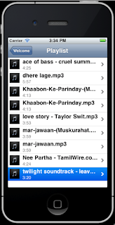
This screen contains table view which displays title of the song, duration and a little icon in each of its cells. Once a user clicks on a song, first the title will be read aloud and a second tap will play the song navigating to the player view.
Player Screen
This is the most complicated screen in this app. It basically holds most of the functions that a user expects to do with a song or any audio. For an instance,
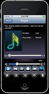
- play a song,
- pause now playing song,
- stop playing a song,
- play the next song,
- play the previous song,
- increase volume
- decrease volume
- mute
- skip forward
- rewind
- view title of the now playing song
- view Duration
- view time leaft
- view play mode
- change play mode (shuffle, repeat)
- switch voice prompt on/off
- let the user post a tweet(post a little comment on twitter) about the currently playing song [the tiny
- button with a twitter icon directs to the twitter screen]
 'Tweet about this song' screen
If you listen to a song and what if you really like it or completely hate it? You may tell a friend. To do so, is there another way to share a piece of comment in a social network where all your friends can read your feeling?
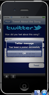
I thought to give the same right to a visually impaired or blind user through this function. All what he/she has to do is to type just two or three words exactly to mention how they feel about the currently playing song. given the few words of the user, the app generates a simple tweet and makes it a tweet to be posted on his.her twitter wall after confirmation. Interesting, isn't that so?
About Screen
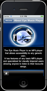
This is a screen with a simple description about the EyeMusix application. All what the user needs to do is to tap on the screen once to listen to the description as read by the voice prompt. Another tap while reading the description will stop reading.
Help Screen
Actually, this screen is similar to an FAQ page in a website. All what i have done is, list down the possible questions that a user can have while handling this app and give a brief description /answer in a separate page about the selected question.
I made available the complete project for your reference.


No comments:
Post a Comment